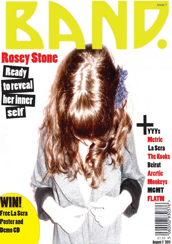
My music magazine challenges and uses convention and features of music magazines I have done this to make my magazine different and distinctive. My front cover has the title block placed at the top centre, the bar code is in the bottom right hand corner, My Main Image has anchorage text next to it and puffs around the image these are common conventions of a music magazine. I have sustained a house style throughout my music magazine I kept the same text font and colours throughout my main page contents and main article this is a common convention of current music magazines. I haven’t really challenged conventions on my front cover as I have throughout my magazine, the main convention I challenged on my front cover is the main image it does not have a direct mode of address and this is not typical of a music magazine but is popular with my target audience in this current age. My title block is visible and not obstructed by an image because it is a new magazine, so the title needs to be clearly so it stays vivid in people’s minds. From my front cover you can also see freebie’s and buzz words attracting new audience. My contents page did not include and ‘Editor’s Comment’ which is used in most music magazines, however my contents page is very simple and easy to navigate it has page numbers next to the pictures making it easy to understand. My contents page also has normal conventions of images next to the features and regulars list. I didn’t want my magazine to have a logo so there is no logo featured throughout the magazine. My contents page has a common structure which makes the audience more familiar therefore making it easier to understand.
My target audience is 16-26 year olds that live in the UK who are interested in indie rock music. My magazine is unisex. Young adults do not usually have a lot of money to spend on magazines, so my music magazine is affordable at a price of £1.50. My front cover uses gender neutral colours (Black, White, and Red) so it could appeal to both sexes it has a slight feminine appearance as I intended it slightly more for a female audience. There is a female artist on the front cover, which is also gender neutral because she can be seen as a role model to young female adults and as a sex symbol for young male adults or they may both just be interested in her as an artist. Indie style clothing is worn by all artists featured in the images on the front cover, contents page, and feature article this is similar to what my target audience would be interested in wearing and it also represents their social group, this makes my magazine more appealing to my target audience. All the artists featured are young, this represents the generation that my magazine is aimed at.
Using my audiences and institution research I think that IPC would be best suited to distribute my media product because they publish both mainstream and niche magazines. Also because they publish other popular Indie magazines such as ‘NME’. I think that IPC media will be better than other companies such as BBC magazine because IPC publish more magazines for my target audience also because BBC magazines publish more niche magazines and my magazine is mainstream. IPC is one of the biggest publishing companies in the United Kingdom having over 27 million readers in Great Britain alone making it incredibly popular. IPC magazines are predominantly known in the UK but are also well know worldwide meaning my magazine can have success in and outside of the United Kingdom meaning they are an incredibly popular publishing company. ‘NME’ also have very famous music channels and radio stations and I hope IPC could make my magazine as successful as ‘NME’ so my magazine can have other media ownership as well.
The Audience for my music magazine is Young Adults, (aged between 16-24 year old) that live in the UK and listen to British Indie Rock music. My magazine should appeal to all races and is addressed at both males and females who are seriously in interested in the Indie music scene. I have chosen this category as my target audience because there are a huge number of people interested in Indie music and not enough magazines catering to their specific music taste, although there are many gossip magazines. I am targeting a younger audience because it is not easy to find an Indie magazines that is not expensive aimed at 16- 24 year olds and I think it’s important that this age group has inexpensive magazines because they are usually living on a tight budget.
In all my images the artists are wearing ‘indie’ style clothing. My main image is taken in a very, popular ‘indie’ style pose that is popular with my target audience. The text is used to attract audience because it is bold and easy to understand; also the colours of the main titles are red making it eye catching and appealing to my target audience. Some of the quote’s and heading I used are white text on a black box, making it very effective and eye catching, this is a common convention in indie music magazines and is very attractive to my target audience. Buzz words are used on my front page to draw in my target audience. I have a young target audience who probably want to get the best value for money. Buzz words such as ‘WIN’ and ‘Free’ are used on my front page to draw in my target audience and let them see that my magazine has other stuff apart from the music articles that can appeal to. My magazine also gives away free demo CD and this is advertised on the front of my magazine in a yellow circle so it instantly attracts the readers’ attention to the freebie. The bottom strip of my main page also has a competition advertising with a buzz word, and from my questionnaire I know this is something my target audience is interested in.
During the process of constructing this product I have learnt how to use numerous technologies. I have learnt to use cameras, I can use them to take a range of different pictured in different shots and also the different effects a camera can do such as sepia, negative black and white etc. I have learnt to use the popular photo editing software ‘Photoshop’ I can change someone’s eye colour, I can use the take a person out of a picture by precisely ‘cutting around them’ and many other useful skills. I have also learnt how to use publishing software ‘Illustrator’ to help me edit my magazine and add the finishing touches such as ‘feathering’ my pictures and how to make my magazine look professional by putting my article into columns. Before making my magazine I did not know how to use software such as Photoshop to edit photos but now I am able to do various things using the skills I have learnt in this short period of time.
Before Editing After Editing


Looking back at my Preliminary Task I feel that I have come a long way. I have learnt how to edit images so they look appealing to my target audience, for example I changed the artist’s eye colour on one of the images used for my final magazine. I also feathered all of the images used for my draft magazine. I used illustrator to help construct my magazine layout. By reading and analysing several music magazines I know what was meant to go in mine and what was typical of a music magazine. Reading/Analysing these magazines helped me write my article so I know what my audience want to read and also construct my contents page in a way that I know will be popular with my target audience. I also learnt that the use of different shots and costumes can help emphasise emotions and give different impressions of the artist, for example the close up shot I used for my double page spread made the artist appear vulnerable and innocent. I looked at other Indie magazines and saw that the set up of my magazine, the colours and the picture types are common in indie music magazines. I learnt that costume plays an important factor as well because it indirectly tells the reader what type of magazine it is. Expressions also important because form the expression the artist has we can tell what magazine it is, for example my artist had a vacant expression never really smiling, which is very common in sophisticated indie magazines such as ‘NME’. From My Questionnaire and analysis of music magazines I also learnt when I wanted to distribute my magazine e.g. Weekly, Monthly, etc this is important because it determines the price of the magazine. From my magazine analysis I also learnt that music magazines mostly use capital letters for the title blocks so I used that as well as this is a convention of music magazines and it looks professional. My preliminary task was very boring and hard to read, and I feel that since then I have learnt to make my writing clearer and how to generally improve my work.