The title block is very bold, and the word ‘Kerrang’ has an exclamation mark giving us the impression that it’s being shouted; this could reflect the type of music that this magazine has to offer maybe the music will be very loud and bold. The word ‘Kerrang’ is an adjective and this could be used to describe sound of the electric guitar that’s used heavily in rock music, this could also used to describe the type of sound that people would make in rock music. The text has got lines through giving us the impression, that it has been smashed up or maybe purposely broken somehow this gives us the impression that someone has smashed a guitar into the title, this is a common thing in the rock music industry the white lines could also simply represent the guitar strings. The text is black and it’s used on a white background this makes the text really stand out because black and white are complete opposites. The black text gives the magazine negative connotations and it’s commonly associated with death, mourning and evil. I think they have been used to give the magazine a dark and feel, and make it very bold so it stand out and is loud just like rock music is. The font is rough around the edges giving us the impression that the letters, giving us the impression, that the music this magazine has is rough as well.
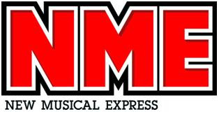
The design of the title block is big and bold; this could mean that the magazine is ‘bold’ and opinionated. It’s red with a white outline then a black outline making black and white were probably chosen because they are two colours that are complete opposites and make the text very obvious and make it stand out more; eye-catching it makes the magazine seem very confident about what they’re selling. NME stand for ‘new musical express ‘ this is telling us what genre of music is typical of this type of magazine will be ‘new’ music, fresh from up and coming bands it could also mean it’s bringing the public new music constantly as it comes out weekly. The font is very alternative and modern reflecting not only the genre of music it contains but the audience as well. The colour red has connotations with passion this means that this magazine could be intensely passionate about what it’s trying to sell and the bands that are in the magazine. The font is quite simple yet very effective; it seems to be making a confident statement. The font is very big and masculine and this also could reflect the target audience who are predominantly men.
From the title we can see the genre of music maybe be old rock, the title has a vintage feel to it and it looks quite old because the writing is joined up this gives us the impression that this title block is more what you would find in a 50s newspaper rather than a modern magazine. They have used red which stand out from the red and black giving it a more 3D and popping effect and making it stand out more. The use of the word ‘Rolling’ gives us the impression that it may be rock and ‘roll’ music that is featured in the magazine. From the title block we can guess that the magazine has an older target audience because it has an old font. The way the letter ‘R’ twirls and flicks make it stylish and sophisticated. Using the colour red can symbolise the passion ‘Rolling Stone’ has for music and the passion it has for everything the magazinse contains such as politics and culture. The writing looks like it has been hand drawn, making it seem more artistic giving it a creative feel, this could also reflect the target audience saying that they too are creative and artistic. We can see that this magazine is going to be very informative not just on music but also on world issues.


No comments:
Post a Comment